Mexico Guidelines
Button guidelines
Accepted terminology: Paga con transferencia or Paga con SPEI or Paga con transferencia SPEI
Supporting images: SPEI logo
To use our assets, you can directly use the URLs we provide, for example:
<button>
  <img alt="Fintoc Logo" src="https://assets.fintoc.com/?img_name=button_cl_light_trailing"/>
</button>
Please refrain from downloading our assets for useWe recommend using the direct URLs to our assets instead. This way, you’ll always have the latest versions without needing to make updates whenever Fintoc changes in the future.
Button
Use this if there are other buttons at the checkout.
| Description | HTML | |
|---|---|---|
 | Mexican dark button with trailing isotype | <img src="https://assets.fintoc.com/?img_name=button_mx_dark_trailing"> |
 | Mexican light button with trailing isotype | <img src="https://assets.fintoc.com/?img_name=button_mx_light_trailing"> |
 | Mexican dark button with leading isotype | <img src="https://assets.fintoc.com/?img_name=button_mx_dark_leading"> |
 | Mexican light button with leading isotype | <img src="https://assets.fintoc.com/?img_name=button_mx_light_leading"> |
Multiple Payment Options
In case there are multiple payment options listed there are three options you can follow:
Combination (Recommended)
If you have more space available, we recommend using the isotype with supporting bank images. We provide you with a single image to reference for ease. Remember that the terminology should be Paga con transferencia or Paga con SPEI or Paga con transferencia SPEI.

| Description | HTML | |
|---|---|---|
 | Combination of dark isotype with spei logo | <img src="https://assets.fintoc.com/?img_name=combo_mx_dark"> |
 | Combination of light isotype with spei logo | <img src="https://assets.fintoc.com/?img_name=combo_mx_light"> |
Logo
If you are using the full logos of other brands, please use the full Fintoc logo. The terminology should be Paga con transferencia or Paga con SPEI or Paga con transferencia SPEI.

| Description | URL | |
|---|---|---|
 | Dark logotype | <img src="https://assets.fintoc.com/?img_name=logo_dark"> |
 | Light logotype | <img src="https://assets.fintoc.com/?img_name=logo_light"> |
Other logo usage
You may want to display our logo to show who your work with. We want to help you do this in the best way.
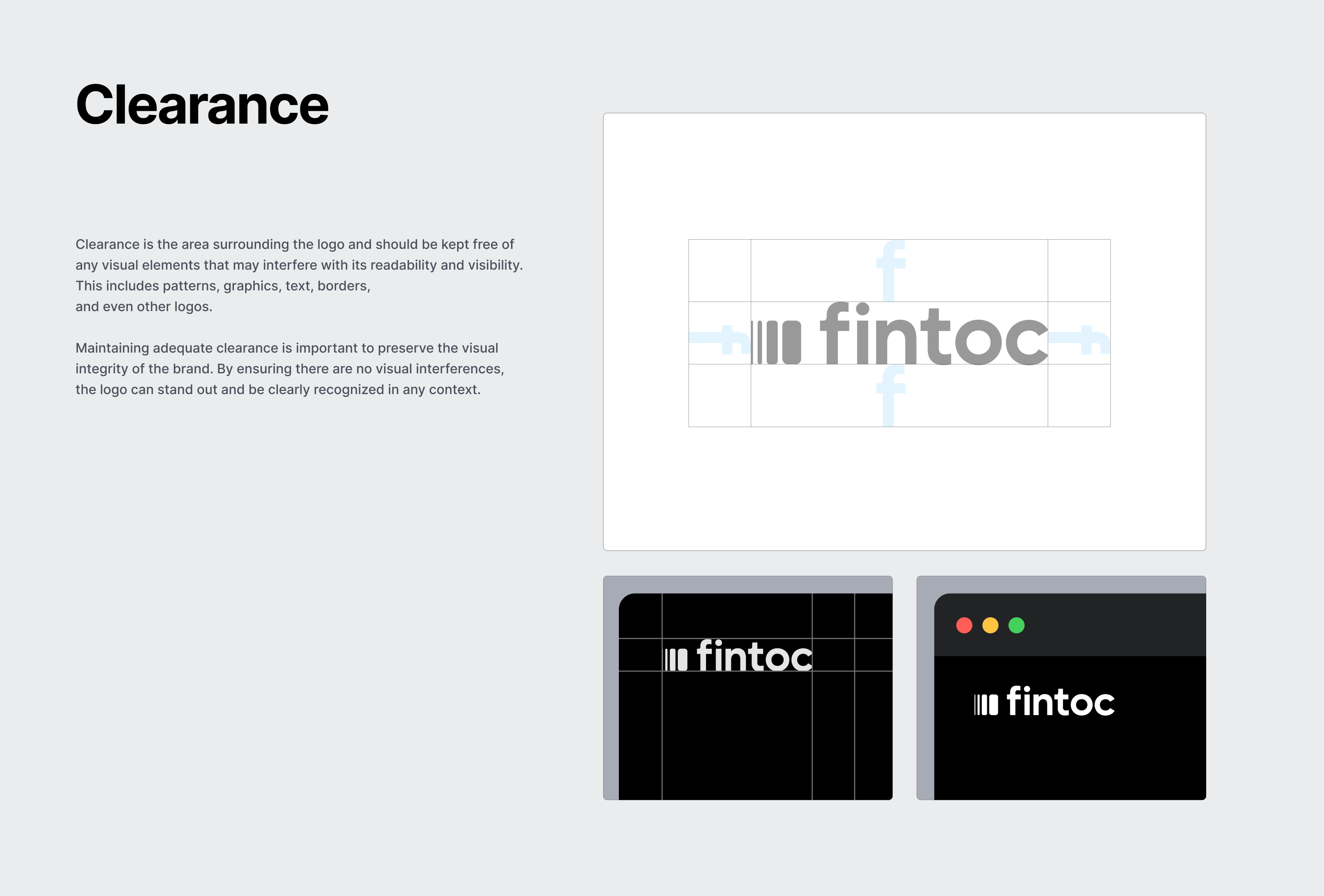
We are providing two URLs for you to embed within your website or app for this purpose. Please leave the recommended safe space around our logo.
| Description | HTML | |
|---|---|---|
 | Dark imagotype | <img src="https://assets.fintoc.com/?img_name=imagotype_dark"> |
 | Light imagotype | <img src="https://assets.fintoc.com/?img_name=imagotype_light"> |

Other recommendations
Pre-filling user's information
If you have access to a user's payment information (like their telephone number), you can pre-fill this information for users, it will be editable by your user. This is useful to avoid extra steps.
Use our widget guide to get more information on how to pre-fill the username field.
Keep your current background
When opening the widget, don’t redirect users to a new page as this will create new friction points for your users. Instead, keep them in your app or website and open the widget on top and overlay your current screen.
Avoid duplicated UI elements
For a user-friendly experience, avoid repeating the same elements. At Fintoc, we've integrated navigation into the widget, so users can easily access features without unnecessary clutter. This ensures a smoother, more intuitive journey through the platform.
React appropriately when there are errors
Small errors will always be handled and mitigated by Fintoc within the widget but in the case that final state ones exist, you should react appropriately to each one in order to ensure a retrial of the process. Currently, failed payments include an error_reason to indicate what caused the transaction to fail. You can check them out here.
We highly recommend that for these you urge your user to retry the process with the proper modifications as well as indicate that no money was moved given the error explained.
Close the loop
When a payment succeeds, it’s important to minimize friction from Fintoc’s flow back into your website or app. We highly suggest you show the consequence of using Fintoc, explaining to your user what happens next. Here are some common use cases:
- P2P Transfers: Reiterate that the money has been sent and show their account minus the money that was just moved.
- Fintech wallets/investment: show their account screen with new money clearly added and visualized.
- E-commerce: show a confirmation screen that includes information about the amount paid, billing information, the products purchased, address and delivery date if applicable, or further instructions to obtain the product.
Updated 3 months ago